1.2 For the knowledge points, it’s necessary to take the "Guidance-Self-Test" teaching methods
Guiding design throughout the course, such as Course Guidance and Chapter Guidance, oversee the whole learning process as well as simulation exercises. It is important to lead students into learning by guidance, especially for learners who lack sufficient self-learning ability. Students ought to feel as if a teacher is always around them during the learning process. Self-directed learning content need strengthen the refined design, both conventional teaching resources and expanded teaching resources, to meet the needs of students with different learning levels. As learning assessment design, there are learning while practicing, chapter self-test and mock examinations. According to students’ own situation, they choose and complete the exercises, self-test.
1.3 Learning resources with real-time transmission
Taking into account pad capacity constraints, students can download from the learning-by-chapter, update learning content and personalize independent learning offline. This can occur anytime, anywhere to efficiently use time. With the development of future network services, real-time online learning will gradually become the mainstream, allowing learners to obtain new learning content in the shortest possible time.
2. Media selection and design
A survey shows that the most popular media is in audio and video form. Such media’s sensory effect is strong and able to be accessed more easily via mobile devices than the network. But among text, images, animation, audio, video and hyperlinks, which forms are most suitable for mobile learning? Answers are listed below:
2.1 Form of media and features suitable for pad
Pad screens are larger, but that does not mean we can arbitrarily pile a lot of content because text-heavy content makes learners easily bored. Therefore, text is only used when we want to present basic concepts and facts. Through colorful pictures, videos, audio and other forms of media, the fun of learning resources can be increased. This plays an important role in exciting and maintaining learners' interest. However, the pad itself has some limitations, including small screens as well as low storage and processing capabilities. The dominant forms of mobile learning content should be static text and still images. We should not blindly pursue dynamic multimedia effects, as shown in Table 1.
Table 1: Media and application characteristics in mobile learning
|
Forms of media |
Application characteristics |
|
Text |
Basic concepts and functions |
|
Picture |
Image display and intuitive processes, structures, processes schematically |
|
Audio |
Used in conjunction with text and picture, smaller memory than the video |
|
Animation |
Technical principles, difficulty to explain |
|
Video |
Display location material, computer screen operation |
2.2 The length of media
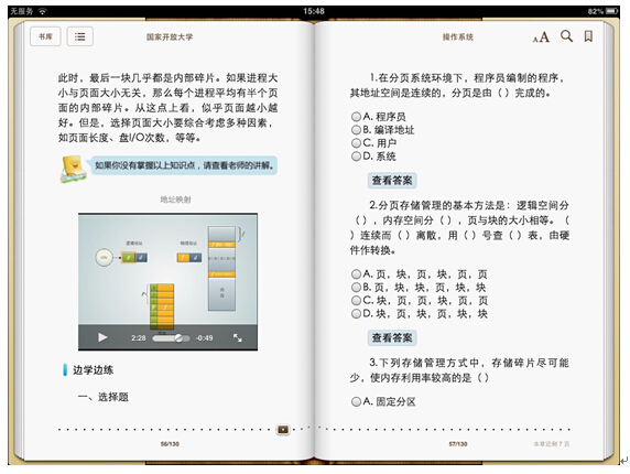
The ubiquitous nature of mobile learning means that learning environments can range from a quiet classroom to a noisy subway. The design should consider the transformation of the environment and learner’s status changes. Researchers at the Stanford Learning Lab found that mobile learners are susceptible to outside influence, and subsequently cannot maintain concentration for long periods. To solve this problem, learning time is considered in the design of modules. The duration of each learning module is limited at between 30 seconds and 10 minutes.[13] Of course, the length of the media should take into consideration the learners’ own qualities, such as attention span, learning equipment functionality and performance (including content presentation and media effects). The quality of learning resources, learning content of strength (such as the degree of difficulty) and other relevant factors must also be considered. Therefore, the length of audio or video in the operating systems’ course is controlled within 5 minutes as shown in Figure 2.

Figure 2: Video in operating system course
3. Interaction design strategies
3.1 Optimizing human-machine interface
Be sure to use the traditional versatile interactive mode of operation. Pad-based learning resources must be optimized for fingertip operation. On one hand, the object must be large enough. According to Apple's "iPhone Human Interface Guidelines", the smallest icon size is 44 × 44 pixels; On the other hand, the distance between the object and fingertip is also very important. If it is too close, it can easily lead to misuse. Different operating habits for fingers should be taken into account. General index finger for clicks and thumb-sliding pages may be used.[14] In the use of gestures, interactive learning content must meet the user's operating habits. For example, flip sliding, kneading and open representation with zoom in and out should be used. Core operations need to use common gestures and cannot require users to use overly complex actions as this will reduce users’ patience.
3.2 Easy interaction and feedback
Interactivity is an important aspect of the design of mobile learning resources. In addition to man-machine interaction, learners and resources, learners and teachers, learners and learners’ interaction design is also very necessary in operating system digital textbooks. The embodied interactive instructional design includes the creation of learning activities to achieve interaction between learners and digital textbooks. When learners encounter problems, they can resolve them through built-in pad functionality by e-mailing teachers or other students for help.